

How I solved: Interactive rating component challenge
A Frontend Mentor challenge for user interaction and update the DOM.


Quick summary
The aim of this article is to provide one solution to the Frontend Mentor interactive rating component challenge.
Frontend Mentor is a platform that provides frontend projects to anyone who wants to practise and improve their skills. The interactive rating component challenge is a good way to exercise handling user interaction and updating the DOM.
P.S. I am not affiliated with Frontend Mentor.
Requirements
Technologies: HTML, CSS, JS
Tools: text editor (I use VS Code), Sketch/Figma (I use Figma), Github
Introduction
With the interactive rating component, the user can:
Select and submit a number rating (from 1 to 5)
See a "thank you" card state after submitting a rating (with a message showing the selected rating)
View the optimal layout for the component depending on their device's screen size (the project has to be responsive)
See hover states for all interactive elements on the page (ratings and submit button)
Multiple step explanation
Getting started
Download the starter code
Set up the project with version control (you can use Git directly with VS Code)
Create a GitHub repository. As you'll have to add a repository URL when submitting a solution, you might as well create a repository at the beginning of the project; also it's always a good practice to have a GitHub repository for a project, even for a personal one, in case you need to show your projects 😊
Check the design from the Sketch/Figma file (only for PRO subscriptions) or check the layouts from the JPEG design files, read the README file, and get styles from the style-guide file
Now it's time to start building the project! 🚀
Project images
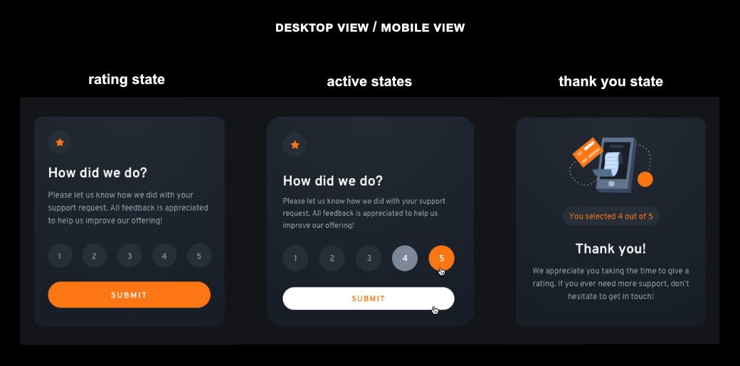
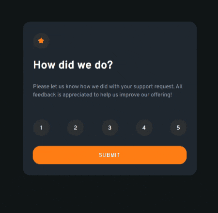
P.S. I chose to present just one image for both the desktop view and the mobile view because the layout is the same, the only difference is related to margins and paddings between the elements.
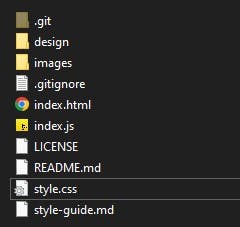
Folder structure
Here is the folder structure of my project:
HTML
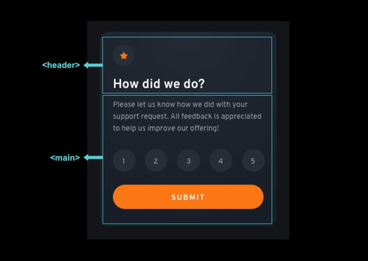
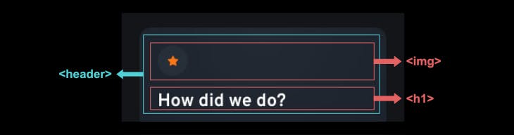
Looking at the component's rating state design, we can structure it in two larger sections represented by the <header> and the main <main> elements of the HTML.
These two elements are semantic elements, and, along with others, were introduced with HTML5.
A semantic element clearly describes its meaning to both the browser and the developer, which leads to a more readable code, accessibility improvement and a good influence on the page's search rankings, among other benefits.
This leads us to the basic structure of the project:
<!DOCTYPE html>
<html lang="en">
  <head>
    <meta charset="UTF-8">
    <meta name="viewport" content="width=device-width, initial-scale=1.0">
    <title>Frontend Mentor | Interactive rating component</title>
  </head>

  <body>
    <!-- Rating state starts -->
    <header></header>
    <main></main>
    <!-- Rating state ends -->
  </body>
</html>
We'll then add all the other elements and the provided content.
Inside the <header> element there's an <img> tag (the icon star) and an <h1> tag (the top-level heading of the component):
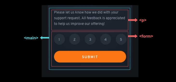
Inside the <main> element there's a <p> tag (the paragraph) and a <form> tag (containing the interactive controls where the user can choose and submit ratings):
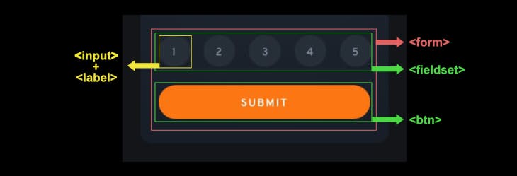
In the <form> element we have a <fieldset> element that groups five <input> (type="radio") + <label> group tags (enclosed by <div>s), and a <button> (type="submit") tag:
Translated to code:
<body>

  <!-- Rating state start -->
  <header>
    <img src="images/icon-star.svg" alt="" class="header-img margin-bottom">
      <h1>How did we do?</h1>
  </header>

  <main>
    <p class="margin-top margin-bottom">Please let us know how we did with your
      support request. All feedback is appreciated to help us improve our offering!</p>
    <form>
      <fieldset>
        <div>
          <input type="radio" name="ratings" value="1" id="rating-1">
          <label for="rating-1" class="flex">1</label>
        </div>
        <div>
           <input type="radio" name="ratings" value="2" id="rating-2">
           <label for="rating-2" class="flex">2</label>
        </div>
        <div>
          <input type="radio" name="ratings" value="3" id="rating-3">
          <label for="rating-3" class="flex">3</label>
        </div>
        <div>
          <input type="radio" name="ratings" value="4" id="rating-4">
          <label for="rating-4" class="flex">4</label>
        </div>
        <div>
          <input type="radio" name="ratings" value="5" id="rating-5">
          <label for="rating-5" class="flex">5</label>
        </div>
      </fieldset>
      <button type="submit" id="form-submit-btn" class="margin-top">Submit</button
    </form>
  </main>
  <!-- Rating state ends -->
</body>
As you can see, <div> tags are also used. The <div> element is a non-semantic element. Unlike semantic elements,
non-semantic elements don't convey any useful information about the structure of the document, and using them gets the code hard to read.
That's why, as a general rule of thumb, the <div> element should only be used for layout purposes.
Outside the <main> element, we have the modal.
A modal is a dialog box/popup window that is displayed on top of the current page. ---w3schools
In the modal, we can see an <img> tag (for the "thank you" illustration provided), an <h2> tag (heading level 2) and two <p> tags.
<!-- Thank you state starts -->
<div id="overlay" class="flex">
  <div id="modal">
    <img src="images/illustration-thank-you.svg" alt="">
    <h2 class="modal-heading order-3">Thank you!</h2>
    <p id="modal-msg" class="order-2"></p>
    <p class="order-4">We appreciate you taking the time to give a rating. If you ever
    need more support, don’t hesitate to get in touch!</p>
  </div>
</div>
<!-- Thank you state ends -->
We now have our component structured with HTML, let us proceed styling it with CSS. 🎨
CSS
The design is quite simple and, as previously mentioned, there's no layout change between the desktop view and the mobile view, just minor variations in margins and paddings.
We'll start by using CSS as an external style sheet. What does this mean? It means we'll write CSS in a separate file with a .css extension, and then we'll link it to our HTML file using the <link> tag inside the <head> element. We'll also add the font family provided picked from Google Fonts — the Overpass font family.
The <head>element for this challenge is now complete:
<head>
  <meta charset="UTF-8">
  <meta name="viewport" content="width=device-width, initial-scale=1.0">
  <!-- Google font -->
  <link rel="preconnect" href="https://fonts.googleapis.com">
  <link rel="preconnect" href="https://fonts.gstatic.com" crossorigin>
  <link href="https://fonts.googleapis.com/css2?
  family=Overpass:wght@400;700&display=swap" rel="stylesheet">

  <link rel="icon" type="image/png" sizes="32x32" href="./images/favicon-32x32.png">
  <!-- linking to external CSS style sheet -->
  <link rel="stylesheet" href="style.css" media="screen">

  <title>Frontend Mentor | Interactive rating component</title>
</head>
Rather than presenting a CSS step-by-step solution, I prefer to talk about some formatting and style strategies or concepts used.
Style sheet with topics
For code readability, it's useful to organize CSS in some way. You can start by having commented sections in the style sheet, e.g.,
/* --------------------
    Custom properties
----------------------*/
More examples of what I used in the following topics.
CSS custom properties
CSS custom properties, CSS variables, or cascading variables are a way to reuse values throughout the style sheet. They start with two dashes (--) followed by a property name, a colon and a property value, like so:
--clr-light-grey: hsl(217, 12%, 63%);
where "clr" is just an abbreviation of "colour", so "clr-light-grey" is meant to be "color light grey"; as this is a custom property, you can name it whatever you want, but it's wise to give it a meaningful name.
To access this custom property, use var(--clr-light-grey) inside a ruleset, like so:
p,
span {
    color: var(--clr-light-grey);
}
Now you can easily update the custom property value in just one place if you need to, and it gets updated on the entire page.
Custom properties can be defined on the:root pseudo-class, where they get a global scope — this is a common best practice 👍. In the challenge I used:
/* ----------------
Custom properties
------------------*/
:root {
    /* colors */
    --clr-dark-blue: hsl(215, 20%, 16%);
    --clr-light-grey: hsl(217, 12%, 63%);
    --clr-medium-grey: hsl(230, 6%, 19%);
    --clr-orange: hsl(25, 97%, 53%);
    --clr-very-dark-blue: hsl(216, 12%, 8%);
    --clr-white: hsl(0, 0%, 100%);

    /* font-sizes */
    --fs-400: 15px;
}
Universal selector
The CSS universal selector (*) matches elements of any type. It is useful when we want to apply a property to all elements of the page.
CSS reset
As not all browsers apply the same default rules, there are lists of rules that "reset" all of the default browser styles. Different approaches were taken throughout the years. In this project, I used part of the "light" approach by David Bell.
/* --------------
    Reset
----------------*/

/* Box sizing */
*,
*::before,
*::after {
    box-sizing: border-box;
}

/* Remove default margins and paddings */
body,
h1,
h2,
p,
fieldset,
input,
figure,
picture {
    margin: 0;
    padding: 0;
}

/* Set core body defaults */
body {
    min-height: 100vh;
    text-rendering: optimizeSpeed;
    line-height: 1.5;
  }

  /* Make images easier to work with */
img,
picture {
  max-width: 100%;
  display: block;
}

input {
    appearance: none;
}
Meaningful class names and modifier class names
In this challenge I don't use any CSS naming convention in particular as it's a really small project. I try to give classes (and id) meaningful names, e.g., container, header-img, form-submit-btn and modal-heading, but I also use what can be called modifier class names, i.e., class names related to properties that are going to change and that I can reuse whenever necessary.
One example can be:
.flex {
    display: flex;
    justify-content: center;
    align-items: center;
}
With a class named "flex" I know it must be related to display: flex;, so I give this class to any element that needs to have this kind of display.
Media queries
CSS media queries are a way to apply CSS only when the browser, the user's device or system settings match a specified rule. So, they are a fundamental part of CSS to ensure a responsive design.
The basic syntax for a media query:
@media media-type and (media-feature-rule) {
  /* CSS rules go here */
}
And one example taken from the challenge:
@media (min-width: 35rem) {
    .margin-top {
        margin-top: 2em;
    }

    .margin-bottom {
        margin-bottom: 2em;
    }
}
The classes .margin-top and .margin-bottom will get the specified values for their properties when the user's device has a minimum width of 35rem.
You can choose to group media queries at the bottom of the style sheet or right after a "section" in CSS.
The rest of the CSS looks like this:
/* set up the body */
body {
    font-family: 'Overpass', sans-serif;
    font-size: var(--fs-400);
    color: var(--clr-white);
    background-color: var(--clr-very-dark-blue);
}

  /* ----------
    Typography
---------------*/
h1 {
    font-weight: 700;
    line-height: 2rem;
}

p,
span {
    color: var(--clr-light-grey);
}

button {
    text-transform: uppercase;
    letter-spacing: 0.08rem;
    color: var(--clr-white);
}

button:hover {
    color: var(--clr-orange);
    background-color: var(--clr-white);
}

button:focus {
    border: 2px dotted var(--clr-orange);
    font-weight: 700;
}

.attribution {
    font-size: 0.73rem;
    letter-spacing: 0.5px;
}

  /* ---------------
    Modifier classes
--------------------*/

.flex {
    display: flex;
    justify-content: center;
    align-items: center;
}

.order-2 {
    order: 2;
}

.order-3 {
    order: 3;
}

.order-4 {
    order: 4;
}

.margin-top {
    margin-top: 1.8em;
}

.margin-bottom {
    margin-bottom: 1.8em;
}


@media (min-width: 35rem) {
    .margin-top {
        margin-top: 2em;
    }

    .margin-bottom {
        margin-bottom: 2em;
    }
}

/* ---------
    Layout
------------*/

.container {
    background-color: var(--clr-dark-blue);
    max-width: 23.5rem;
    padding: 2em 1.66em;
    margin: 1.33em;
    border-radius: 1.33em;
}

.header-img {
    border-radius: 50%;
    padding: 0.9em;
    background-color: var(--clr-medium-grey);
}

.attribution {
    position: fixed;
    left: 50%;
    transform: translate(-50%);
    bottom: 20px;
}

.attribution a {
    color: var(--clr-white)
}

.attribution a:hover,
.attribution a:focus {
    color: var(--clr-orange);
}

@media (min-width: 35rem) {
    .container {
        max-width: 29.2rem;
        padding: 2em 1.8em;
    }
}

 /* -----------
    Components
---------------*/

fieldset {
    border: none;
    display: flex;
    justify-content: space-between;
}

input[type=radio]:hover + label {
    background-color: var(--clr-light-grey);
}

input[type=radio]:focus + label {
    border: 2px dotted var(--clr-white);
}

input[type=radio]:checked + label {
    background-color: var(--clr-orange);
}

label {
    width: 45px;
    height: 45px;
    border-radius: 50%;
    background-color: var(--clr-medium-grey);
    padding-top: 0.33em;
    cursor: pointer;
}

button {
    background-color: var(--clr-orange);
    border: 0;
    border-radius: 20px;
    padding: 1.3em 0;
    width: 100%;
    cursor: pointer;
}

/* -------------------------
    Modal - thank you state
---------------------------*/

#overlay {
    width: 100%;
    height: 100%;
    position: absolute;
    top: 0;
    left: 0;
    right: 0;
    bottom: 0;
    background-color: hsla(0, 0%, 0%, 0.5);
}

#modal {
    display: flex;
    flex-direction: column;
    justify-content: center;
    align-items: center;
    text-align: center;
    position: relative;
    background-color: var(--clr-dark-blue);
    max-width: 23.5rem;
    padding: 2.66em 1.8em 3em 1.8em;
    margin: 1.33em;
    border-radius: 1.33em;
}

.modal-heading {
    order: 3;
    margin: 1.33em 0;
}

#modal-msg {
    order: 2;
    color: var(--clr-orange);
    border-radius: 1em;
    margin-top: 1.66em;
    padding: 0.5em 1.06em 0.26em 1.06em;
    background-color: var(--clr-medium-grey);
}

@media (min-width: 35rem) {
    #modal {
        max-width: 29.2rem;
        padding-bottom: 3.33em;
    }
}
After the structure and the styling, we'll need to work on the user interaction 👆, and for this, we'll need JavaScript.
JS
As we did with the CSS style sheet, the JS file will also be linked to the HTML file. We could work from inside the HTML file, by writing JavaScript between the opening and the closing of the <script> HTML element, like:
<script> /* write JavaScript here */ </script>
and this is usually fine if we have a really small script. In this project, the JS file is quite small, nonetheless, the benefits of using a separate JS file can't be overlooked. So, we start by creating a separate file with a .js extension and link it to the HTML file inside a <script> element right before closing the <body> element:
<script src="index.js"></script>
One way to start tackling JS is to first think about what needs to happen, and what problems need a solution.
By looking into the challenge introduction, we know that:
The user can select a number rating (from 1 to 5)
The user submits the selected number rating by clicking on a submit button
A "thank you" card state pops up with a message showing the selected rating
To improve user experience, the "thank you" card only appears for a certain amount of time
Now, to use JS to make things happen we must first "get" the elements we're going to use by accessing the DOM (or Document Object Model), and then assign each one to a block-scoped variable declared by the const keyword:
const inputRadio = document.querySelectorAll('input[name="ratings"]')
const formSubmitBtn = document.getElementById('form-submit-btn')
const modalMsg = document.getElementById('modal-msg')
const overlay = document.getElementById('overlay')
And also, we must not forget to hide the modal (the modal only becomes visible when the user submits a number rating):
// modal initial hidden state
overlay.style.display = 'none'
After that, for the user to select a number rating we must find a way to get the value from the input he clicked on, and then set that value to the message in the modal. We can get the value by iterating over a NodeList using the forEach() method, adding a click event to the input rating, and using the value property from the input field.
A NodeList is what we get from running document.querySelectorAll. We can see this by writing
console.log(inputRadio)in our JS file, and then check the Console panel in the developer console:NodeList(5) [input#rating-1, input#rating-2, input#rating-3, input#rating-4, input#rating-5].
If we check what we get with console.log(), we easily see where the input value comes from and how to use that value in the message from the modal:
// get value rating from input radio
// set thank you message
inputRadio.forEach(element => {
    element.addEventListener('click', () => {

   // if the user clicks 5, this logs <input type="radio" name="ratings" value="5" id="rating-5"> to the console
   console.log(element)

   console.log(element.value) // 5

   // assign element.value to a new variable
   rating = element.value

   // set the HTML to the modal
   modalMsg.innerHTML = `you selected ${rating} out of 5`
   })
});
Now the user must be able to submit his number rating by clicking the submit button, after which a "thank you" card state pops up for a few seconds with a message showing the selected rating:
// click event
// uncheck input radio
// hide modal after a certain amount of time
formSubmitBtn.addEventListener('click', function(event) {
    event.preventDefault()

    inputRating.forEach(element => {
        // if element is checked, in this case, if input type radio is checked, run the following code
        if(element.checked) {
            element.checked = false
            overlay.style.display = 'flex'
            setTimeout(() => {
                overlay.style.display = 'none'
            }, 2000);
        }
   })
})
The project is now completed, and here is the live demo: interactive rating component.
Conclusion
In this article I wanted to show how I solved the Frontend Mentor interactive rating component challenge in a simple and not exhaustive way, meaning that the aim was not to give a full explanation of all the hows and whys, but rather to provide some guidance from the beginning to the end of the project.
I know that sometimes is difficult to know where to start a project, so here we went from the very beginning and saw how to structure HTML and what semantic elements are, we also talked about some strategies and concepts in CSS, and finally, we reached JS and talked about how to add the functionality needed so the user could click and receive feedback.
This was also my first technical article ever. I must confess I felt some difficulties while writing it, and it took me longer than I expected. I think most of the difficulties were due to a mixture between poor planning and first-time-ever-doing-something.
Thanks for reading 😀! I hope you find this article useful. Feel free to leave a response, or you can also connect with me on Twitter and let me know what you think about this article.
Resources
Semantic elements: MDN, W3Schools and Ken Bellows
How to structure a website: GeeksforGeeks
Modals: W3Schools
Custom properties: Chris Coyier|CSS-Tricks
Universal selector: MDN
CSS reset: CSS Remedy project — a CSS reset github page that also provides an overview of previous CSS reset projects — and David Bell
Media queries: MDN and Andrés Galante|CSS-Tricks
How to add JavaScript to HTML: Lisa Tagliaferri|DigitalOcean
forEach() method: MDN
The DOM: W3Schools
DOM input radio checked property: GeeksforGeeks